Project #1: 2D Mini Studies
Part 1: Black and White
Objective
Grid an 11 x 14 sheet of white paper into one inch squares. Cut a 7 x 11 sheet of black paper into 77 black squares. Place the squares on one side of the centerline on the larger, white paper. Now move one square at a time to the symmetrical opposite position in the white area. When you are through, any square that is occupied on one side of the line should be blank in the mirror-image, on the opposite side.
The objective is to create a figure that fulfills the following criteria:
1) Balance the two sides of the composition
2) Consider figure/ground vs. field
3) Eliminate the central seam-line
4) Try to create a visually pleasing or provocative form.
Design Process
My initial idea was to use
a computer to help create designs. Why?
| • | The virtual medium allows for rapid iteration as opposed to moving snippets of paper. |
| • | It is easy to capture previous designs. As a result, I do not have to be afraid of losing a previous design. This will let me get into a much more creative, experimental flow. |
| • | I can put the application on my Web page and access it from anywhere -- work, home etc. |
| • | The computer will not make any mistakes, so I can work faster. |
| • | I can take the assignment further by trying to create computer-generated solutions. |
Implementation
I created a Java Applet that lets me create designs rapidly. Please try it! A Java Applet is an application that runs within a web page. It's a bit slow on older computers, but not bad. I printed everything I liked and picked the best ones.
 |
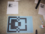
Finally, I cut the shapes and glued them onto a white sheet. |
Result
I decided to create two designs. Click on the image to see a larger version.
Part 2: Color
Objective
Develop a 1"x1" gridded composition on an 11x14 sheet. You should use 2 tones of a preferred color and can use one contrasting color. The composition need not be symmetrical, but it must feel balanced.
Design Process
The horror! Paint! I don't know how to paint anything. The acrylic color thing is one big disaster.
I wanted to create a very strict, mathematical image that builds on some of the qualities that the black-and-white composition shows. I iterated a few times on grid paper, then went to paint with acrylic on car stock.
Implementation
 |
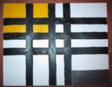
The horror in progress... click on the image to see the full extend of the disaster. |
Result
 |
No surprise that I am not happy with the end result. Is it upside down? Lesson learned: use masking tape to paint anything that requires straight lines. |